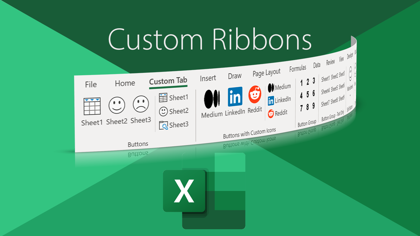
How to Build a Custom Ribbon in Excel
From How to Build a Custom Ribbon in Excel | by Andrew Moss | CodeX | Medium
How to Build a Custom Ribbon in Excel
Using XML and VBA
Microsoft’s ribbon interface has been with us since the launch of Office 2007. Although met with mixed reaction, over time many acknowledged it was a viable replacement for the ageing bland menus we had become accustomed to.
Microsoft developed the ribbon to increase user awareness of what was nested within each Office product. It was said that users would frequently request new features, oblivious to the fact that the very things they wanted to accomplish were hidden away in amongst a plethora of menu options.
For the most part, the ribbon has solved this issue due to its more aesthetically pleasing design and how it splits up the different sections.
In this article I’m going to focus specifically on the Excel ribbon. However, given the architecture is the same across the board, you can apply the same principles to the other Microsoft products as well.
The wrong way to build a system
Up until a few months ago, the way I would have built a navigation or interactive system in Excel was completely different. I’d have used the in-built Form Controls, which contains objects like buttons, drop-downs and checkboxes—and dumped them at the top of each worksheet. This got the job done, but there were a few disadvantages of this approach:
- each set of navigation buttons had to be repeated for each worksheet
- worksheet real estate was reduced due to the space the systems took up
- scrolling vertically or horizontally meant the navigation buttons went out of view (Freeze Panes was not the solution)
Here’s an example:

Roughly a quarter of the vertical space is occupied by the navigation and interactive systems. This may not matter for people like myself, who look at spreadsheets on a 32" 4K monitor, but for those viewing it on 13" laptops with substandard 1280 x 800 displays — the experience is very different.
By utilising a customised ribbon, worksheet space can be preserved, scrolling reduced and the duplication of Form Controls no longer necessary. The user also has the option to minimise the ribbon, hide the formula bar and headings if need be.
Download the example file
I will take you through step-by-step starting from scratch, but have included a complete file for your convenience:
You need to have a Windows desktop copy of Excel (Excel 2007 onwards) to go through this tutorial. Mac versions will load the custom ribbon successfully, but the creation process is different. I am only covering the Windows method.
It’s unlikely you’ll want everything I’ve included in my ribbon, so I recommend having a fresh workbook open alongside this file, so you can cherry pick the relevant code snippets.
The ribbon will be built using XML and VBA. Although it’s possible to build one by going to File > Options > Customize Ribbon, you do not have much control over what it will look like, as you’re limited to one type of button and a set of default images. The customisations will also only appear on your computer, as they are not technically saved in the workbook file.
If you’re brand new to XML, it’s worth scrubbing up on the basics. Check out w3schools.com for a quick introduction.
Likewise with VBA, Excel Easy is a good place to go for learning the fundamentals.
Workbook composition
It may surprise you, but an Excel file is composed of XML files. You can build your custom ribbon by manually creating certain files. However, this is a bit of a faff and isn’t necessary most of the time. I’m going to show you an easier method that still involves creating and editing files, but some of the legwork is taken out.
In any case, it’s worth exploring the structure of the Ribbon-Example.xlsm workbook by carrying out the following steps:
- Change the file’s extension to .zip format; do this by renaming it. You’ll get a warning window that pops up, but just say yes to it.

2. Right-click on the .zip file and choose Open. The folder contents will look like below, although the customUI folder will not be present unless it’s already been created.

3. Inside the customUI folder is the customUI14.xml file, which contains all the code that relates to the main structure of the custom ribbon.

4. Go into the _rels folder and you’ll see the sole file is customUI14.xml.rels, which defines the images used by the ribbon controls. Their ID name and file path are specified, and it is the IDs that form a relationship with their twins in customUI14.xml.
The images folder houses the control icons just mentioned, and it is vital the file paths point to the right place, otherwise the images won’t show up.
5. Now you know how to view the composition of the workbook, change the file extension back to .xlsm.
The best way of building a ribbon
Fernando Andreu’s Office RibbonX editor simplifies the process of building a custom ribbon. It provides you with a useful interface to create, edit and manage the XML files and images associated with a workbook.
See for yourself.
Download and install the program, load it up, click on Open and browse for the Ribbon-Example.xlsm file.

Where you save the most time is at step 4, because you do not need to create an additional file to specify any image relationships. This is automatically done for you.
To add a Custom UI part, click on the workbook in the side pane and then go to Insert and choose the appropriate option based on your version of Excel. For most of you this will be Office 2010+ Custom UI Part. You will see that the file customUI14.xml appears at the side.

Double-clicking on this file opens it up in a tab, allowing you to start building your ribbon!
customUI14.xml file
The basic structure of the customUI14.xml file comprises several elements:
customUI
<customUI> </customUI>
As the starting element, the xmlns attribute allows you to specify the schema. This describes the structure of the document and allows all the elements to be read successfully.
Use http://schemas.microsoft.com/office/2009/07/customui if you’re running Excel 2010 or above.
ribbon
<ribbon> </ribbon>
References the ribbon and its contents.
startFromScratch: set to true if you want to hide all default tabs.
tabs
<tabs> </tabs>
Refers to the tabs in the ribbon collectively.
tab
<tab> </tab>
Specifies a tab in the ribbon.
id: name that uniquely identifies your tab.
label: name of tab, which will be visible in the ribbon.
insertAfterMso: tab you want your custom tab to appear to the right of. If you want it on the left, use insertBeforeMso instead.
What does this look like in practice?
At this point we have a basic skeleton structure:
⚠️ Ensure you close the associated workbook first before attempting to save the customUI14.xml file, otherwise a warning message will appear.
If you open the workbook, your tab will be visible in the ribbon but won’t contain anything inside it yet:

Adding controls and attributes
The next step is to create a group in between the <tab> </tab> tags:
group
<group> </group>
All ribbon controls must be contained within a group.
id: unique identifier of group.
label: name that appears underneath the group displayed in the ribbon.
Used for all sections (essential).
Within this group you can choose to include any control from the list in the official Microsoft documentation. My advice is to refer to this frequently because everything you need is there. You will find some controls have more attributes and callbacks than others.
I would also recommend the docs at Better Solutions if you’re looking for something a bit more stripped down.
Attributes
There are several notable attributes you will see:
id: unique identifier of a control. Each id can only be used once, and every control must have one.
label: name that appears on control.
size: size of control. There are two options: large or normal.
onAction: name of callback function requested when control is invoked.
onChange: name of callback function requested when text changes in editBox.
getText: name of callback function requested for determining what text should be shown in editBox.
imageMso: name of built-in image.
Check out bert-toolkit.com for a complete list of imageMSO icons you can use.
If you wish to use custom images for your icons, you must first upload them by right-clicking on the customU14.xml file and selecting Insert icons…. Then you need to use the image attribute to reference the file name.
idMso: name of tabSet and tab.
You’ll use this when you want to add a control to a default or contextual tab.
For some reason, Microsoft’s documentation for this attribute is almost non-existent. You’re better off downloading hugojr’s excelcontrols.xlsx file, which contains a huge table featuring every control, tab and tab set name.
If you wanted to hide a certain tab, you would use visible="false" after specifying the tab’s idMso.
Defining controls

None of the controls will be functional at this stage. That will only happen in the next section when the VBA code has been implemented into the workbook.
Some controls have been used in multiple sections and combined with others so they are operational.
I’ve briefly described each control used:
button
<button />
A standard button that executes an action when clicked.
Used for Buttons, Buttons 2, Button Group, Button Group 2, Split Button, Menu, Spinner, Gallery, Home Tab and Contextual Tabs.
menu
<menu> </menu>
A dropdown with a list of choices. A menu must be wrapped around another control, such as a button. They can also be nested to create submenus.
Used for Split Button and Menu.
separator
<separator />
A vertical separator line that can be placed in a group to split controls up appropriately. It is shorter than the group lines that automatically display.
Used for Buttons, Buttons 2 and Toggle Button
buttonGroup
<buttonGroup> </buttonGroup>
A grouping container that allows controls to be placed horizontally together.
To start a new row, you have to create a new buttonGroup within the same group. A maximum of three are allowed.
The attribute showLabel has been set to false for each button in Button Group because labels can only be shown if there is no image. This must be explicitly set because it defaults to true.
Used for Button Group, Button Group 2 and Spinner
2.2.5 buttonGroup (Button Grouping Container)
togglebutton
<toggleButton />
A button that can be switched on (pressed state) or off (unpressed state).
Used for Toggle Button.
2.2.43 toggleButton (Toggle Button)
dropDown
<dropDown> </dropDown>
A dropdown box that contains a list of options the user can choose from.
This control requires at least one button or item element wrapped inside it.
Used for Dropdown.
2.2.17 dropDown (Drop-down Control)
item
<item />
Provides an option for the dropdown box or gallery to display.
Used for Dropdown and Gallery.
splitButton
<splitButton> </splitButton>
A button which has two parts. The top half acts as a regular button, whereas the bottom half is a dropdown menu.
Used for Split Button.
2.2.38 splitButton (Split Button)
checkbox
<checkbox />
A standard checkbox that equals a Boolean value of true when checked, and false when unchecked.
Used for Checkbox.
gallery
<gallery> </gallery>
A dropdown that contains clickable images, which can be arranged in a way that suits you.
Used for Gallery.
editBox
<editBox />
A box that allows a string to be entered.
The one place this control has been used for is the spinner. There is no single control for a spinner, so the workaround is to combine an editBox with increase and decrease buttons that dictate the value.
Used for Spinner.
box
<box> </box>
An invisible container that houses controls in a group.
Used for Spinner.
2.2.1 box (Box Grouping Container)
labelControl
<labelControl>
A textual header that is typically placed next to another control. It can also be used as a dummy for aligning other controls.
Used for Checkbox, Dropdown and Spinner.
2.2.25 labelControl (Text Label)
contexualTabs
<contextualTabs> </contextualTabs>
A tab that is only displayed in the ribbon during certain scenarios.
This element must go inside the <ribbon></ribbon> tags, but outside of <tabs></tabs>.
If you click on the table in Sheet1, the newly created Custom Contextual Tab shows up. The default Table Design tab also appears with a new button in it.

Notice how for the first part, the idMso attribute has been used to specify the default tabset and tab. The former is only used for contextual tabs and needs to be placed after the <contextualTabs> tag.
Used for Contextual Tabs.
Making the ribbon functional
So far only the design of the ribbon has been created, but this section focuses on the VBA code in the workbook, which is necessary for its functionality.
In the Ribbon-Example.xlsm file, press Alt + F11 to open the VBA window and you’ll see a list of modules in the left panel pertaining to each section of the customUI14.xml file.
For your own workbook, click on Insert > Module and copy across the relevant procedures for the sections you’ve included in your XML document.
Each module contains at least one procedure, and every procedure name mirrors its callback equivalent in the customUI14.xml file.
“A callback is a function that executes when the user interacts with the ribbon XML control.”
I will use a shortened version of the Buttons module for my example, however, the concept is very similar for ButtonGroup, SplitButton, ToggleButton, DropDown, Gallery, Menu and ContextualTab.

You’ll see the procedure name has been defined as btns_onAction, and this matches up with the onAction="btns_onAction" XML attribute that’s present in each button tag.
What does this do? It fires up the macro when any of the buttons that contain this callback name is clicked on.
Given that multiple buttons have the same callback name, what happens then? A Select Case statement is used.
Select Case control.id selects the control (the button in this case) and its ID. control is a variable, and it has been defined as an IRibbonControl. This is an object that allows ribbon controls to be passed through.
Each Case is listed by stating its ID in quotes followed by the macro you want to execute. As this ID can only be used once in the whole XML document, it will know which part of the code it needs to reference.
Once you've finished your Select Case statement, close it with End Select. Use End Sub to do the same for the procedure.
Ensure you save the workbook first, close it and then save the XML file. Reopen the workbook and check the buttons are working.
If there is something wrong with the XML code, you won’t necessarily know what it is straight away, so I would strongly advise you turn on the error warnings in Excel (if they aren’t already). Go to File > Excel Options and ensure that the Show add-in user interface errors box is checked.
If you are greeted by an error message on opening, then take note of the details—including the line number so you can swiftly sort the problem out.
Next, let’s turn our attention to the CheckBox module.

This is a very short procedure used to print the status of the checkbox to cell H9 of Sheet1. If it is checked, then TRUE is displayed. If unchecked, then FALSE is returned.
The argument isPressed has been set as a Boolean, which means it holds only two possible values. This is fed into the chkBox_onAction callback and H9 is instructed to equate to its value.

You’ll see the isPressed argument is present in the ToggleButton module as well. This control also has only two states.
The Spinner module is the final one I’ll go through. It’s easily the hardest to understand, too.

Given that no spinner control exists per se, the only workaround is to use an editBox alongside two small buttons that can increase or decrease the value. This means several procedures are required to facilitate its functionality.
At the top, two variables have been declared, as they are used multiple times in the module. rbxUI represents the ribbon interface, and SpinValue is the numeric figure that appears in the editBox.
The first procedure targets the rbx_onLoad callback that exists in the <customUI> XML tag as part of the onLoad event. Using a Set statement allows the rbxUI object reference to be assigned the value of ribbon (the variable passed into the callback).
So, just to reiterate: the value of rbxUI is equal to the custom ribbon at load-time. This variable is used again in the spin_onAction procedure, which I’ll come on to soon.
If you delete what’s in the editBox, the editBox_onChange procedure ensures that 0 is always the default value when you start increasing or decreasing from nothing.
In plain English, the If statement says: if the length of the value is more than zero characters, then check if it is of numeric type. If it is, the value of the editBox equals its input. If not, then it is 0. And in all other cases, return 0.
On initialisation, the editBox_getText procedure assigns the value of the aforementioned SpinValue to a new variable called returnedVal. Using the ByRef keyword, this is then passed to the callback as a reference. 0 will always display when you open the workbook, irrespective of whether you saved it in a certain state.
The spin_onAction procedure controls the actions of the increase and decrease buttons.
As the two buttons use the same callback name, another If statement is used. It says:
If the control is the increase button, then SpinValue equals the current value of SpinValue plus one. Otherwise, if the control is the decrease button, then SpinValue should equal the current value of SpinValue minus one. In any other case, exit the procedure.
In addition, the linerbxUI.InvalidateControl "editBox" uses the InvalidateControl method to redraw the editBox when the spinner is invoked.
And finally, the value of the spinner (SpinValue) is displayed in cell J9.
Final words
When I started this article, originally I planned to show you how you could implement a handful of standard buttons in your custom ribbon. However, as I researched and experimented, I realised how many possibilities there were.
I think I have done a bit more than just ‘touch the surface’, but there are simply too many variations to cover everything.
With the workbook I’ve provided and your newly acquired knowledge of how to create a ribbon, hopefully you can put it to good use. I’d like to think it has given you food for thought with how you can build better interfaces and a great foundation to get started.
Perhaps you’re a sales analyst with a series of reports you want stored in an organised structure. Or maybe you’re a teacher who relies on spreadsheets to track your students’ progress. For either scenario, a ribbon-based menu system can save you time and effort in the long run.
For myself, I will be using a customised ribbon in every example workbook I post from now on, containing links to my Medium, LinkedIn and Reddit pages (as you saw 😉).
Ultimately, what you do with it is up to you.

Comments
Post a Comment